Here are some of the early experimentations I have been doing for the NYJC branding. I started using scatter brushes in illustrator to create this kind of fragmented effect but I found the shapes were too small and it was hard to get the right balance considering the logo would have to work on small formats as well. initially I was not pleased with many of these results so I tried some other ideas and tried to simplify the shapes.
Saturday, 29 January 2011
Tuesday, 25 January 2011
Geometric Jazz
When we first started brainstorming ideas in groups about our NYJC branding my personal initial thoughts lead to me thinking of procedurally generated geometric patterns of some sort, these ideas of fragmented shapes forming other things appealed to me as it seemed to have a lot in common with the ideas of jazz, and we all wanted to stay away from any clichéd symbols such as saxophones.
I did some research on generative, procedural, fractal art and all that jazz (excuse the pun) and found a very interesting project called Advanced Beauty which procedurally generates geometric based art by reacting to audio stimuli, i really liked the look of the interacting shapes and also the shading of them as it is I think in some way 3d rendered gives it a nice look and is something I think I may try and imitate in my work.
Friday, 21 January 2011
David Mascha - Fauna
I find it hard to say that much about this illustration as it speaks for itself in how damn good lookin' it is. But nonetheless I love the colour use palette, almost an autumnal vibe, combined with the subtle use of textures and of course the curvature of it gives it such a natural feel.
You can see more of his work here.
Saturday, 15 January 2011
NYJC branding
Last week I was given the brief for our first project, mine is to re-brand, or rather brand the National Youth Jazz Collective, an organisation dedicated to mentoring young talented jazz musicians. They wanted an entirely new identity to give the idea of creativity, spontaneity almost an explosion of harmonious chaos. Or at least thats what I got from it.
Wednesday, 12 January 2011
Particle collection from Matthias Müller on Vimeo.
This is another example of the coolness of Krakatoa particle effects at its swankiest. as I mentioned in my previous post I think the potential not only for motion graphics but the use of a single frame in printed materials is really cool.
I think I need to get better with 3DsMax.
Tuesday, 4 January 2011
Realflow and Krakatoa
This is a video of a one million particle water simulation render done using realflow and karakatoa, obviously I didn't do this partly because it would probably take a year for me to render, but I just think the potential for use even utilising single frames in 2d print work could look quite spectacular.
Realflow is used for a lot of big budget movies, it utilises something called the hybrido water simulation system which means it is good for rendering vast quantities of water particle simulations which can then be transferred into an application such as 3DsMax and rendered in that using krakatoa which is a particle effects plugin.
Tuesday, 28 December 2010
Vicente García Morillo...Is the bomb.
Vicente Garcia Morillo is an illustrator and graphic artist from Madrid and I seriously dig his style, his superb use of the gradient mesh tools and pattern brushes and what not as well as a cheeky bit of added noise gives such a great texture to his images, while they yet still retain an electronic, or not real factor that provides a nice contrast.
Thursday, 16 December 2010
Be Ready flyer design, May Contain Nuts
This flyer is for Be Ready Records' New Year's Eve night, originaly they wanted printed flyers but due to a lack of time they just had a web one, it's not a great flyer by any means, it felt quite rushed, largely because it had to be. But it helped me start to get the hang of the gradient mesh tool which is fantastible.
Tuesday, 7 December 2010
Aurelius International Commissioned work
A few weeks ago I was commissioned to create a few web based images for Aurelius international, a secretarial and office support recruitment agency. They didn't want me to spend too much time on it and the size and resolution of the images was very strict as they were to be uploaded to a directory service for businesses. The top one is a basic business card design.
World collabs series
This piece, created by Justin Maller is the first of a series of many where artists and established designers are releasing their .PSD files for the rest of the world to see and use in order to further their own design process and create interesting collaborations, below are some reworkings of the above image by Dawid Cmok.
Via Behance
Sunday, 28 November 2010
handmadefonts and their awesome typefaces
HandMadeFonts.com produce their own unique typefaces using specifically photographed and then digitally re-funked pictures to make letterforms the result is some very original type although the sets as with a lot of fonts cost a fair bit at about 250 euros for 10 typefaces.
Tuesday, 23 November 2010
Lego for adult situations
This series of images I thought were quite an inventive use of lego, I like how it looks pixelated and gives a censorship kind of feel, however I was unable to find any details about the artist or how exactly it was done, i.e. with real lego or not.
still pretty cool, you can see the full set of images here
Thursday, 18 November 2010
More really cool projection mapping
New balance sneaker Projection mapping_01 from Hayoung Jung
Here is another example of projection mapping, this time on a trainer, this is more utilised for a specific marketing purpose whereas the other one was just more of a cool tech demo type thing, but this shows the potential marketing value for such a technique, although I think it could be used best at a rave or nightclub type thing, a similar thing was done a matter nightclub before it closed down last year, unfortunately I can't find the video, but it was frickin' awesome.
Via Vimeo
Sunday, 7 November 2010
Graffiti vending machines!
These pictures and a sparse amount of info about these graffiti vending machines have appeared on the internet. The machines, dubbed the Graffomat, are designed to supply all the late night spray fanatics with all the caps, cans, masks and even gloves any regular Banksy would love. There is speculation if they would actually be put in place. But there is a nine minute infomercial style video being used to advertise the product.
Via CpLuv
Via CpLuv
Monday, 1 November 2010
Jared Nickerson Wall coverings
These new wall coverings by my favourite vector Artist, Jared Nickerson are now available to buy and If only I had about £230 to spare I would definitely get one, they are produced by an Australian company called IMGS and are basically just very expensive wallpaper, but still wallpaper I would gladly buy, If I was rich, and had a house with enough wall space. His vector work alone is very impressive and I think he's a good example of looking for maximum amount of ways to make money of his designs, having adapted them into many different formats all available for purchase. Via BloodSweat&Vector.
Sunday, 31 October 2010
My new Behance portfolio
I have just recently created a new portfolio on Behance, which has been one of my favourite sites for inspiration and general checking in on what's happening in all creative fields. I tend to check it every day just to see a nice collection of work from all sorts of different established designers and artists. So now it's good to feel like part of their community. furthermore it's a really good looking and well run site.
Wednesday, 27 October 2010
Peter Steffen Nike T shirt designs
This is one of the new t-shirt designs by Peter Steffen for Nike, you can see the rest here they are pretty damn good and I always have a soft spot for good t-shirt design, despite the overuse of illsutrative type in the past year and a half. That being said his designs utilise it very nicely. I also like his crest like designs, it implies a certain heritage to the company and I have noticed a lot of big brands and companies adopting this feel in recent months. I suppose the question is, what makes a good t-shirt design? And I personally think it takes quite a lot of skill to design something that has simplicity and style for it to work well as a t-shirt.
Saturday, 23 October 2010
Nielly Francoise paintings
These paintings by Nielly Francoise I find really vivid and exciting, they use a high variation of colours yet achieve an almost realistic quality in tone. Via Behance
Thursday, 21 October 2010
Inspirational Projection Mapping Techniques
ENVISION : Step into the sensory box
This video from SUPERBIEN via Vimeo demonstrates a technique around a fair bit at the moment called projection mapping but in my opinion this is the best one i've seen, partly because of the creativity within the medium, he's more playful and inventive with what you can do with it and he also has a boomting projector, either way it's really good.
Wednesday, 20 October 2010
inspirational spaghetti
This illustration by Sakke Soini is quite frankly, really cool. Or at least I thought it was hence why I've decided to put it up it was part of his typographical work and his work also features a lot of retro styled type which also looks awesome.
Via Behance
Tuesday, 19 October 2010
Collagerie
The other day I took part in what was my favourite induction course so far, on image, we created some collages and particularly I liked the study of different ways of interpreting a leaf and redrawing it.
Sunday, 17 October 2010
Ooot 'N' Aboot
About a week ago we went out and about with Paul to the Tate Britain and then to the very nearby Chelsea Space to see an exhibition by Fiona Banner and then subsequently Barney Bubbles. It was definitely a good day and they are both good exhibitions, but I personally preferred the Barney bubbles exhibition. What I liked the most was his amazing clarity and precision before the age of computers
Friday, 8 October 2010
First week of LCC
Well I have pretty much just completed my first week of LCC and have found pretty exciting to say the least, i've already been out and about to the Tate Britain to see massive decommissioned fighter jets suspended from ceilings and lying on the floor in an exhibition by Fiona Banner, learnt a little more about blogs and generally increased my graphical vocabulary and visual repertoire.
All in all it has been a pretty good week and I can't wait for next week.
Tuesday, 14 September 2010
Crest-a-licious
This is probably the last major piece I will make for YouYou as at the end of this week I am leaving to start my course at LCC. It has been a long road of design and particularly for myself of web design, I definitely think my work has improved after having worked here and I feel a lot more confident in designing anything for web application.
Get Some!
Get Some!
Monday, 9 August 2010
The meaning of YouYou
Another marketing advertisement for YouYou.co.uk, based around a simplistic, somewhat mathematical concept trying to define and highlight the meaning of YouYou, combining the people who need people with people who are people if you catch my drift.
Anyway I was quite pleased with the scribble, hand drawn effect in certain places. even if it was quite tricky to implement in certain parts.
Skadoosh!
Friday, 6 August 2010
Wednesday, 28 July 2010
Floral Fantastic
Most of our job seeker marketing is aimed at women, following the previous success of other floral based designs in attracting people to our site, I decided to engineer the design more towards women, built on the floral aspect and added a pinch of summeryness. I was more or less pleased with the result but the real test is always in how well it markets the business.
KaBoom!
Tuesday, 20 July 2010
You Mail Logo
I made this nearly a year ago now when I started working for YouYou, but I still like it because of the simplicity and what not I think it's my favourite logo I have created. Although someone pointed out to me afterwards, it looks a bit like the Postman pat special delivery service logo.
HOOAH
Friday, 16 July 2010
Old marketing for YouYou
Here is another small selection of YouYou.co.uk marketing work. As we have two avenues of people to advertise to there are two designs of a similar theme, they both basically outline our specific recruitment process but the top one is aimed at jobseekers and the bottom one is aimed at companies, the majority of our jobseekers are women, so the design was more engineered towards them whereas the companies one had to be a bit more corporate and as such lifeless and dead like a run over cat. But I was still quite pleased with them as a pair.
much love
Icon Frenzy
I recently redesigned some of the main icons for the YouYou website, Vamped them up a bit and added a load of cool shinyness. I was quite pleased with them but a lot like big brother, YOU DECIDE.
They were pretty fun to make, I think good icons should always look a bit....edible, at least with web 2.0 they all do anyway.
YouYou explosion
Here are some of the more recent works I have made for YouYou.co.uk, the first is marketing aimed specifically at companies looking to hire new employees and the second is marketing for job seekers looking for a job (obviously) I was quit happy with both of these, as they do not look amazing but I feel that I am getting the message across in a simple and design conscious way. Which I guess is what graphic design is about. Or at least I hope so.
Tuesday, 6 July 2010
Beat N Veg
This is a front and back design for an A6 flyer for a night in Bristol put on by a friend of mine, it's from a while ago now but I thought I might as well bang it on.
Thursday, 24 June 2010
Old, old work
I thought I would upload some old work from my deviantart account. The piece above was made for my friends music promotion. It was the first real time I had combined vectors and raster imaging and is still one of my favourite pieces. to check out his tunes go to: http://www.myspace.com/cropstabass They are TASTY.
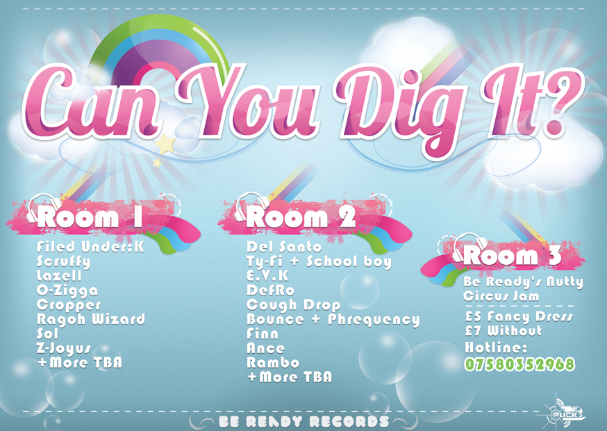
This piece was the front cover design for a Valentine's rave entitled love rush, it was about a year ago, unfortunately due to tight deadlines I spent too long on the front and not enough time on the back, hence why I am only putting the front up here. It was a pretty big success, in fact too many people turned up, causing it to be shut down, but in light of that I think I did my job properly.
Thank you and Banana
Tuesday, 22 June 2010
Your perfect job
It's been a week or two since my last post, but during that time I have at least been working on this, our latest marketing mail out for You You this time trying to visually describe the perfect office. It may not be prefect but if I had a chandelier in my office and a floor full of money, I would say it was pretty damn good. as with most of my work, it was created using mostly photoshop and illustrator to create certain elements.
Banana
Sunday, 13 June 2010
Just another quick post with more marketing material for http://www.youyou.co.uk again for companies featuring the perfect cut out employee.
Banana
Subscribe to:
Posts (Atom)